Design Process
Problem Solving - The true client problem for this project was to design a brand for a new sushi restaurant within the East Side Milwaukee area. The brand needed to have clear differentiation from its competitors and needed to have a fresh take on the sushi industry. The solution for this true client problem was to create a sushi brand that solely targets the foist time sushi eater.
Research - The resources and design strategies that were connected and synthesized included topics such as demographics, psychographics, Maslow’s Hierarchy of Needs, Alreck’s Shopping list of Needs, competition research, and design briefs. Each of these resources and design strategies helped transform the brand essence. Momenta stated that "brand essence is the core characteristic which defines a brand. It is an intangible attribute that separates your brand from your competition’s brand by your audience. It is emotional and based on feelings" (Momenta, n.d.). The final brand approach and the brand essence then played a major role in every design asset that was created for the BoxPark Sushi project.
Innovation - Based off of the primary and secondary research conducted it was determined that there was a market for the first-time sushi eater. From this point on the core focus of the BoxPark Sushi brand was to target the first-time sushi eater and/or a guest who would like to introduce someone to sushi for the first time. The imagery, colors, font styles, and key characteristics all speak to the first-time sushi eater. Each aspect of the brand invites the viewer to come closer by targeting friendly and welcoming emotions. This brand approach is very unique and innovative when compared to other sushi restaurants within the industry.
Logo Design
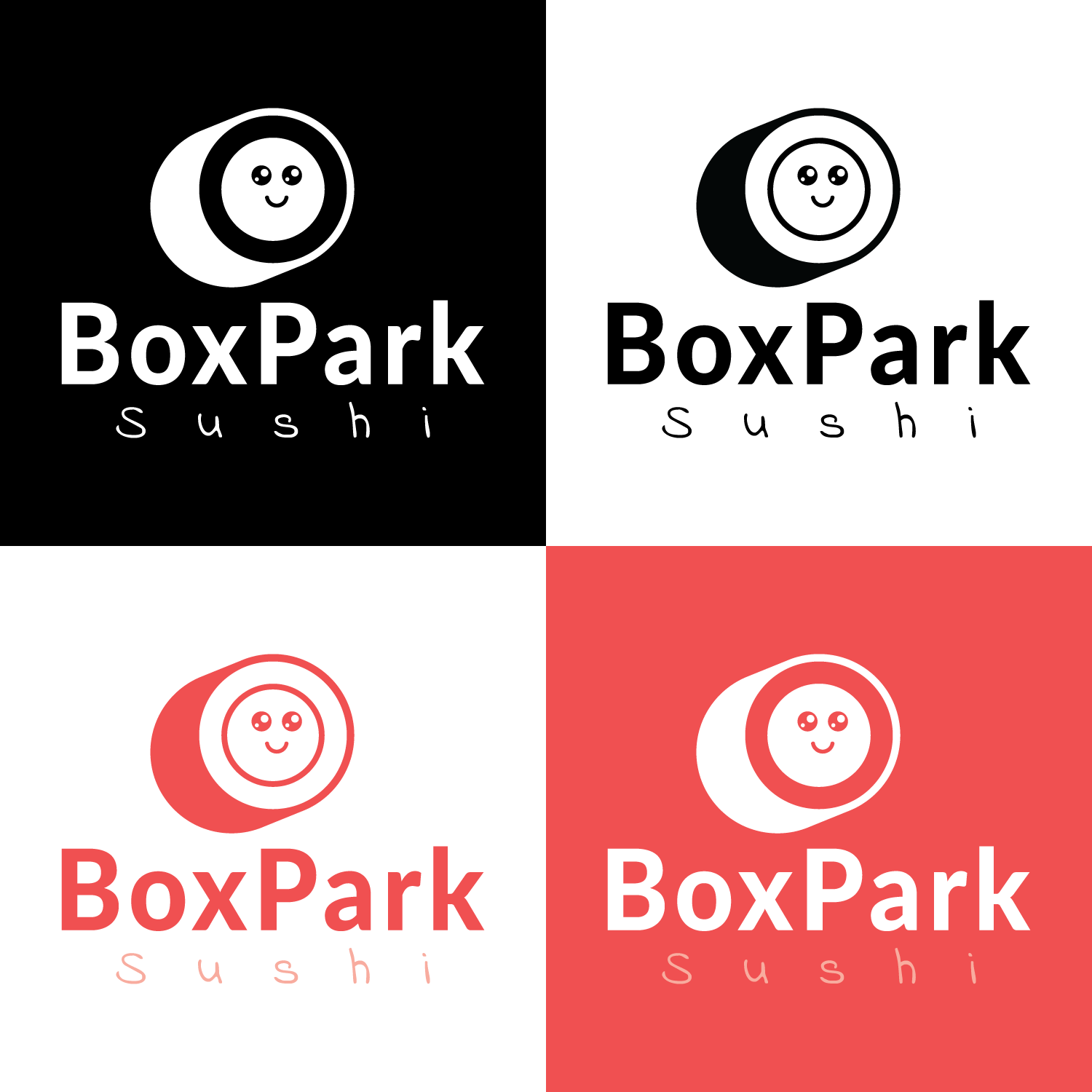
When looking at most competitor logos within the sushi industry, there is a large number of logos that use chop sticks and/or sushi rolls within the logo. This is a trend that is hard to avoid because most sushi restaurants want the audience to know what they are selling just by looking at their logo. The BoxPark Sushi logo is a happy face, which ties into the friendly and welcoming characteristics of the brand. However, the happy face is subtly placed within a minimalist sushi roll design. The BoxPark Sushi logo shows the product, personality, and avoids common design features such as chopsticks.
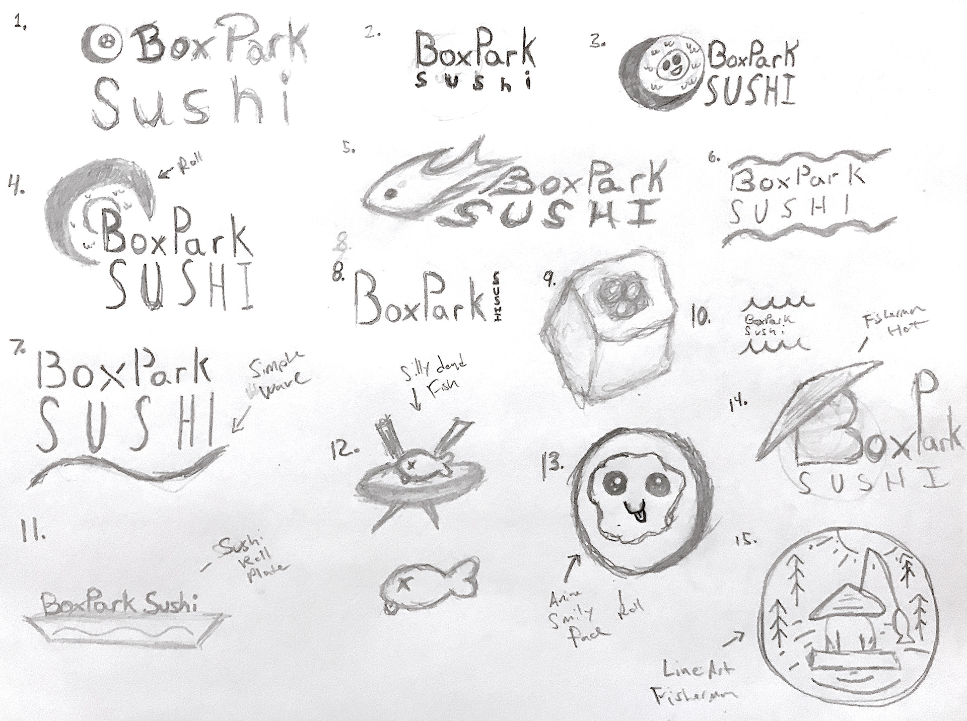
(Logo Sketches)
(Final Logo Design)
Asset Design
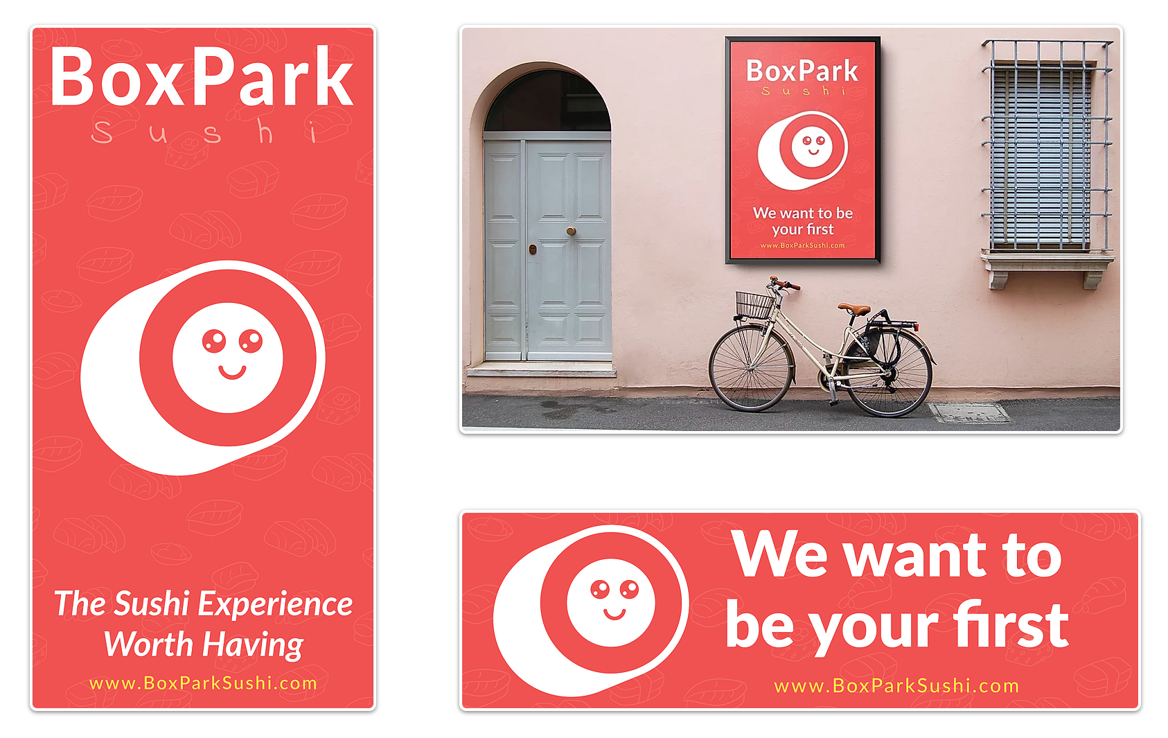
The BoxPark Sushi assets communicate the final attributes of the brand through the colors, voice and tone, shapes, logo, and font pairings. The pinkish/red represents bravery and salmon. Bravery ties into the courage that the first-time sushi eater might need to try sushi for that first time and salmon is of course one of the top types of fish used for sushi dishes. The voice and tone are shown through the tag-lines such as “We want to be your first.” This statement promotes the fact that BoxPark Sushi is looking to cater to the first-time sushi eater and fits within the overall tone of the brand. The shapes help support the educational aspect of the brand. They show fun examples of different types of sushi. The logo focuses on the welcoming and friendly aspect of the brand. The strategic purpose of these assets is to create an asset that can be strategically placed in neighborhoods near the new BoxPark Sushi location and to attract first time sushi eaters.

(Asset Sketches)
(Final Assets)
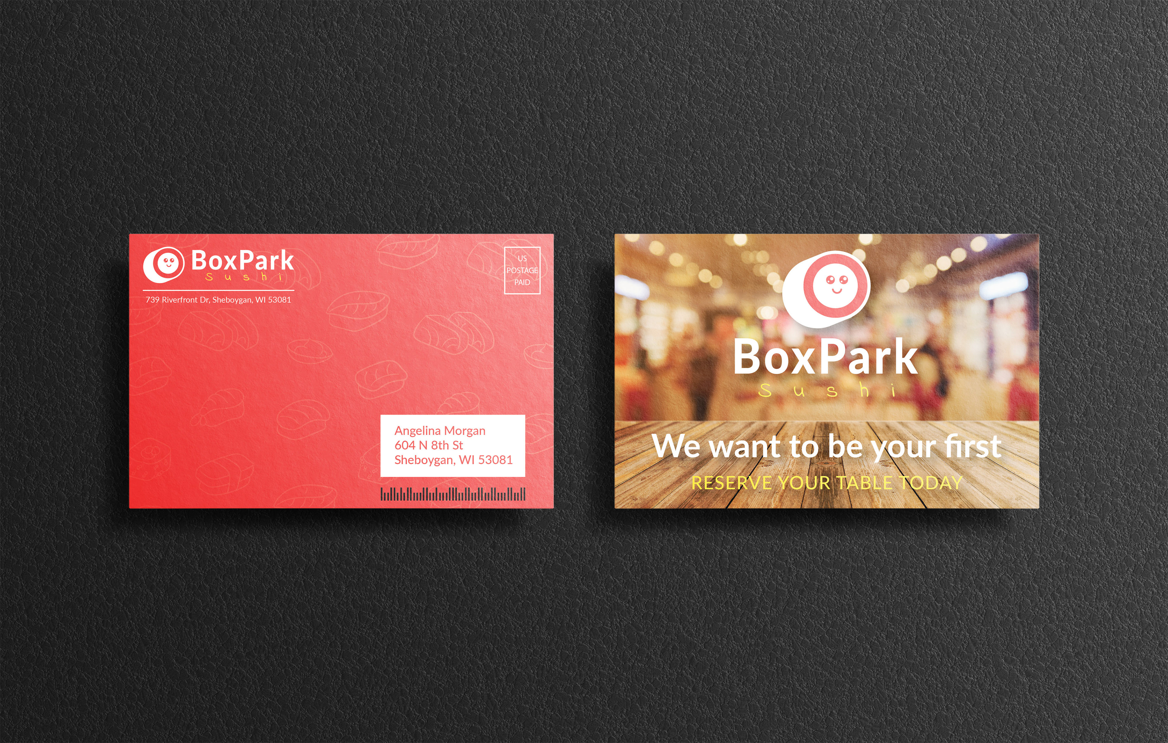
(Direct Mailer)
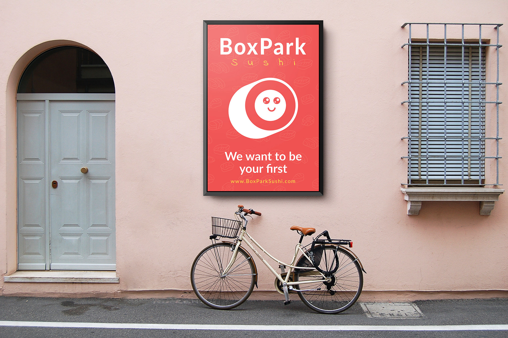
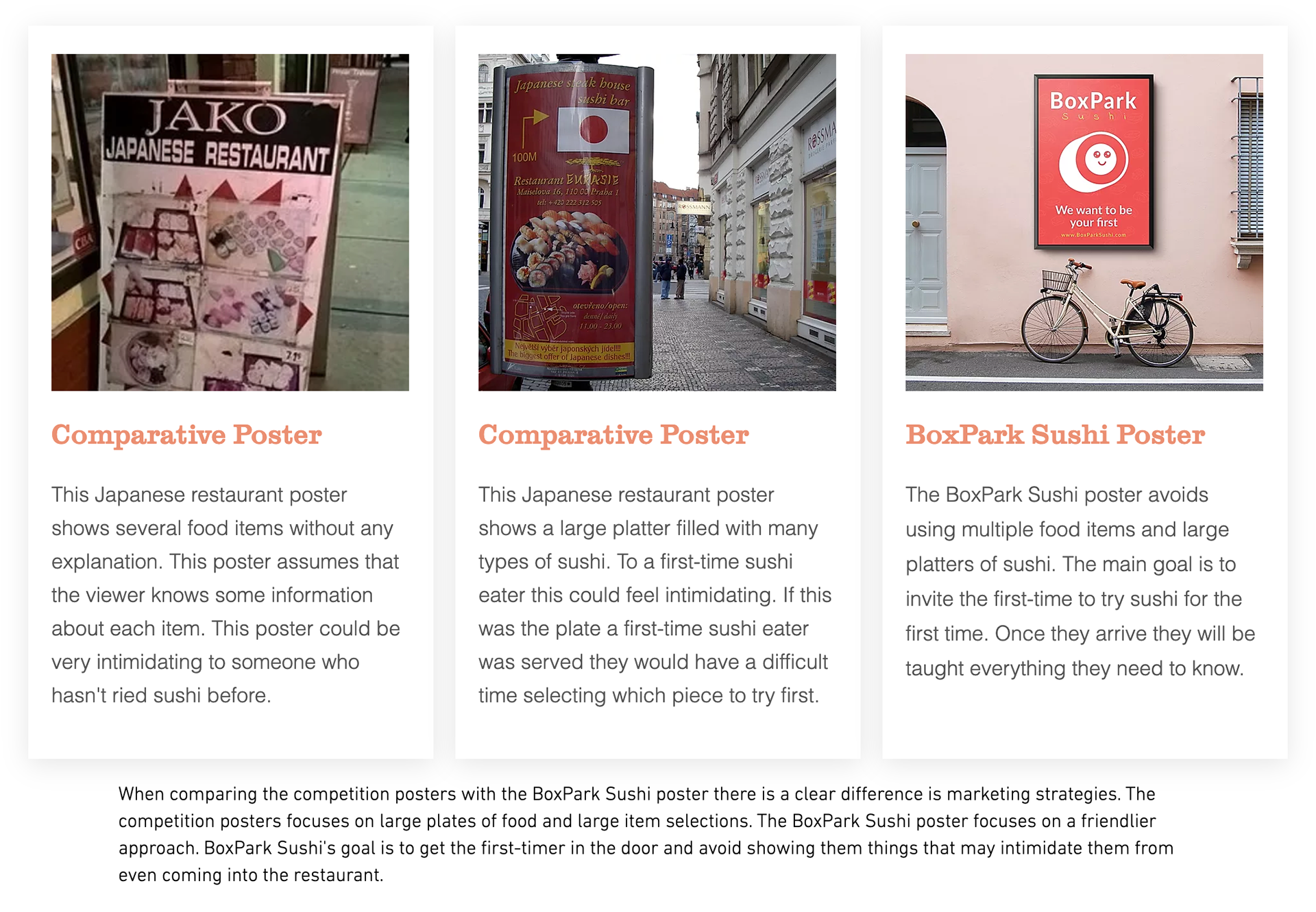
(Final Street Poster)
Measuring for Success
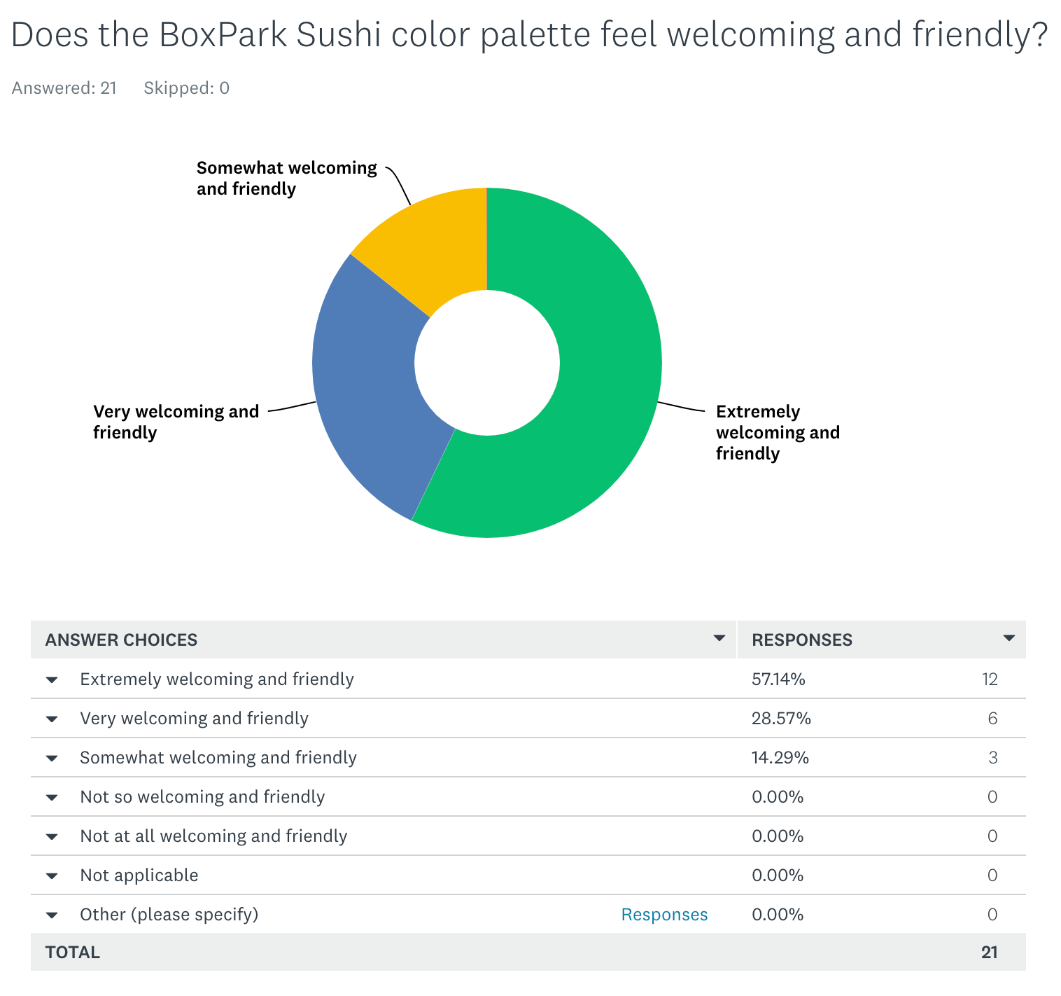
By creating and using a survey it was apparent that surveys have great value to design campaigns. For this survey the BoxPark Sushi brand was reassured that the majority of the design choices were effective. However, It was also discovered that the tag line wasn’t as effective as intended. The survey will now allow the brand campaign to make changes to increase its effectiveness rate.
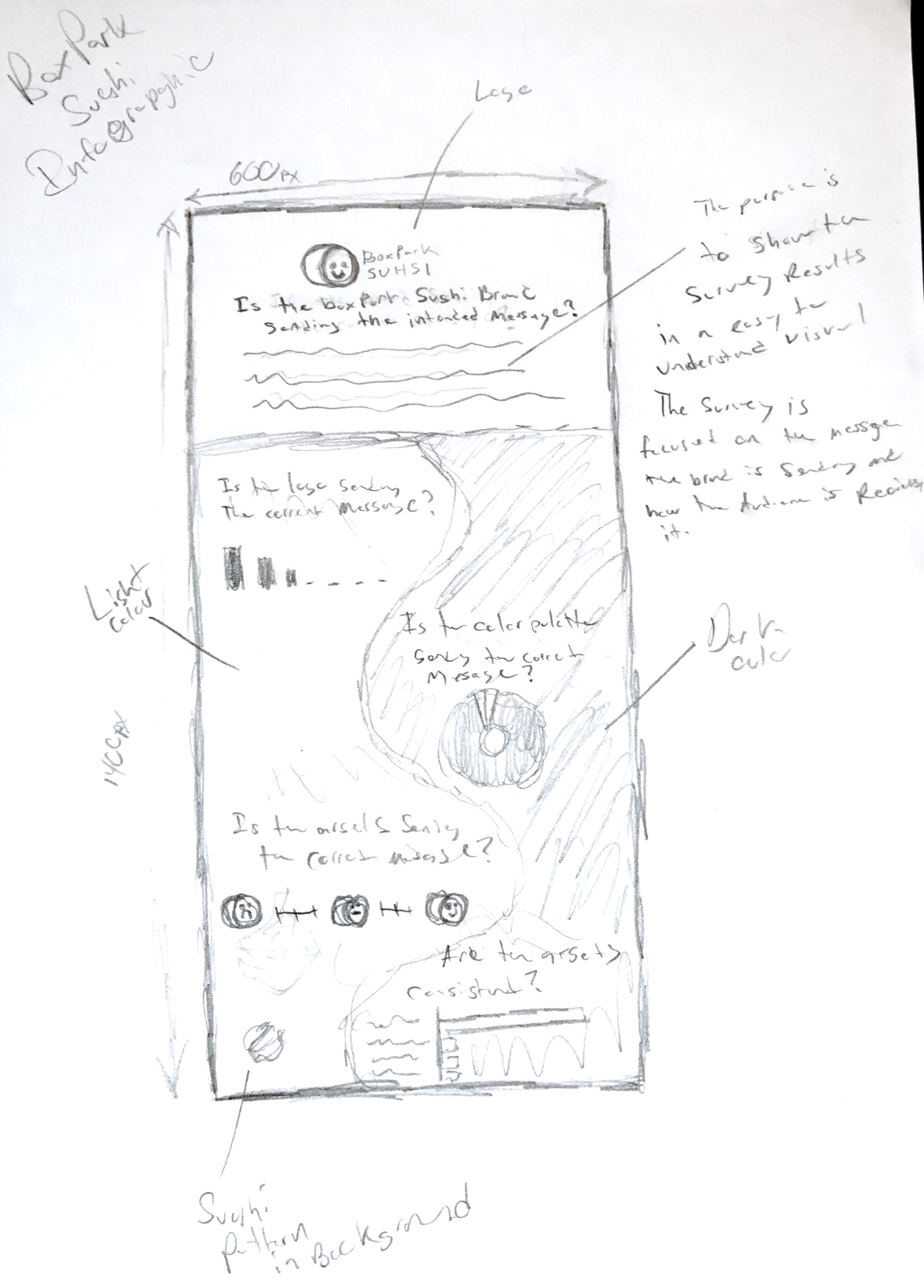
(Infographic Sketch)
(Survey Monkey Sample)
(Final Infographic)